

Redesigned the UW student portal app to improve usability, accessibility, and streamline access to courses, WATCard, schedules, and resources.
June 2025
Project Owner


UX Design
Prototyping
User Research
Wireframing
User Flows
WCAG
🔍 background
As students (especially first-years), we used the portal every day but constantly ran into the same frustrations, difficult-to-read schedules, confusing navigation, and an outdated look. That’s what sparked the idea to reimagine it into a cleaner, more student-friendly experience.
🧩 problem
How might we redesign the university’s portal app so that as a student, I can quickly find my schedule, upcoming events, campus locations, and WatCard info without getting lost in cluttered menus or an outdated design?


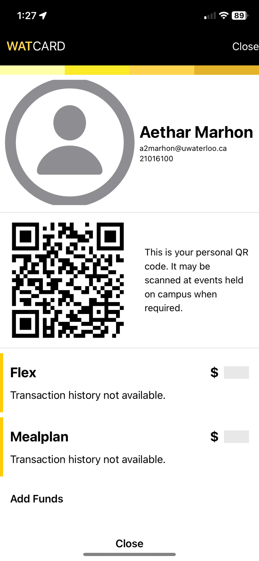
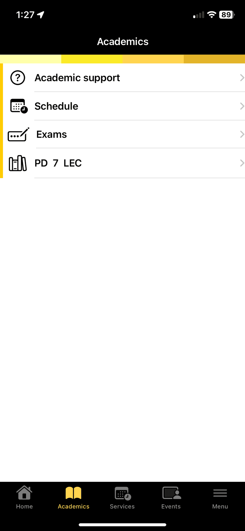


Original UW Portal App Frames
🔬 research
To better understand student needs, I started with primary research by reflecting on my own frustrations as a daily user and gathering quick peer feedback through informal interviews. I also reviewed secondary sources, like app store reviews and university forums, to see what other students were saying about the portal.
Common pain points included buried schedules, too many clicks to find grades, and a cluttered interface that made simple tasks feel overwhelming. From this research, the key finding was clear: students valued speed, clarity, and a clean design that displayed their essentials—like schedules, grades, events, and WatCard info—right up front.
🎯 goal
I wanted to challenge myself with a quick 3-hour redesign. The goal wasn’t to perfect every detail, but to see how much I could improve the portal by focusing on what really matters: simple navigation, a cleaner look, and faster access to things students check every day like their dashboard, profile, and food/events.
🎨 design process
With only 3 hours, I kept things simple: I sketched core screens and mapped quick user flows to see how students would move between them. This helped me focus on a clean dashboard and smooth navigation before moving into Figma.

🥳 final product
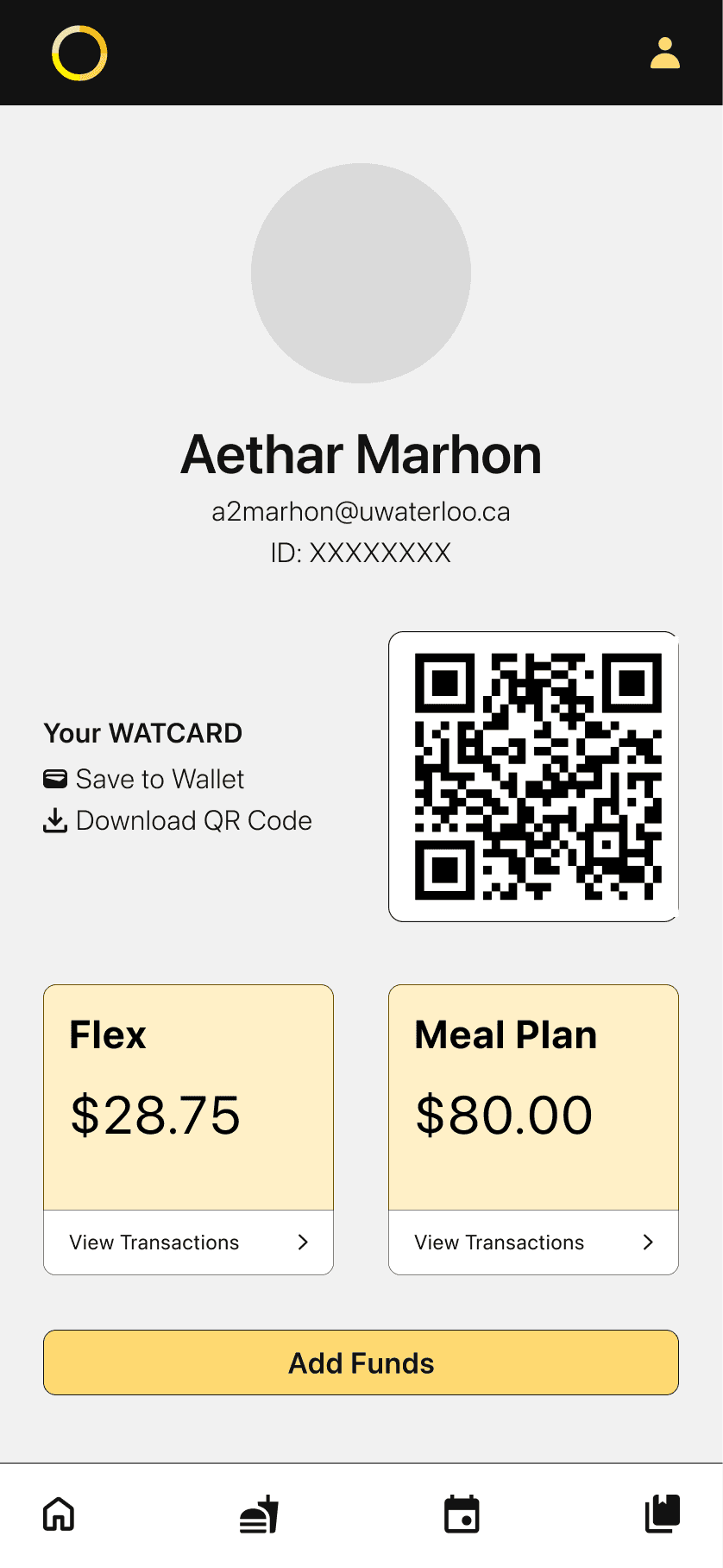
Here’s the finished redesign! I focused on making the portal feel cleaner and easier to use, so students can jump straight to what they need without digging around. I also took accessibility standards into consideration, making sure colour contrasts were clear, icon buttons were large enough to tap easily, buttons were accessible, and more.
🌱 reflection
This project reminded me how much impact small, quick iterations can have. In just 3 hours, I was able to rethink the portal with accessibility and ease of use at the core, turning a cluttered experience into something cleaner and more intuitive. It showed me that even fast-paced design challenges are a chance to practice simplifying complex systems and making technology more student-friendly.

